|
|
|
|
|
|
|
|
JFC
Exhaustion Indicator
The
JFC Exhaustion Indicator is the second of the group of four JFC Indicators which
we will use to further define the short term trend or Minor trend for day
trading purposes.
This
indicator is universal in nature and can be used on any bar chart, any market,
any time frame.
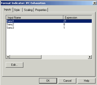
Inputs
There
are three inputs for the JFC Exhaustion Indicator, “SENS1”, “SENS2” and
“SENS3”.
All
of the inputs for this Indicator include various sensitivity settings for the
plots as shown above. As you will notice when you begin experimentation with
this indicator, there are a great number of combinations you will be able to use
to adjust this tool to your individual trading style.
As with all Indicators, the default setting present in the indicators when you receive them are the settings which I have found to be most effective across a broad range of markets and conditions. Although I encourage experimentation with these indicators, keep in mind that the values present here for the JFC Exhaustion are the most effective as represented by my research.
The
first input, SENS1, adjusts the
amount of back data the program will require to generate our screen plots. Only
whole, positive numbers may be used here. Negative values or decimal values will
not result in a useable plot. Therefore, the lower the number, the fewer
bars of historical data that will be used in the calculations, and the more
responsive the indicator will be to back data. Conversely, a larger number will
force the program to consider a greater data base, creating a plot series that
will be less responsive to recent data.
Lower
values result in increased sensitivity while higher values result in lower
sensitivity.
The
second input, SENS2, will adjust the
data which will be used to create the red line of the plot which has the effect
of smoothing out the data stream and removing much of the “noise”, or random
price activity, from the market. Only
whole, positive numbers may be used here. Negative values or decimal values will
not result in a useable plot. The lower the value entered for this
parameter, the less noise will be removed from the calculations, resulting in a
red line which has more movement and thus will generate a greater number of
trading signals. If we use greater values for this input we will see a red line
which is smoother in appearance, showing fewer turns and therefore generating
fewer trading signals.
Thus,
a lower value will result in increased sensitivity for this plot. Higher numbers
will reduce the sensitivity.
The
last input, SENS3, will adjust the
distance between the two yellow plots on the indicator. Any
positive value, including decimals, may be used here. Do not enter negative
numbers. In fact, we encourage the use of decimal values here in order to
more finely adjust the positions of these two plots. A greater value will move
the yellow bands further apart, resulting in a decreased sensitivity and thus
fewer trading signals. A lower value will result in the yellow bands being
plotted in closer proximity to each other, thus creating more frequent trading
signals.
As with our two previous
plots, lower numbers will result in greater sensitivity and more trading signals
while greater numbers will deliver less frequent trading signals due to the
decreased sensitivity as a result of this input setting.
Generally,
the higher the input value for SENS1, the less sensitive will be the plots.
Lower values will increase the sensitivity. You will notice, with lower settings
and thus greater sensitivity, the yellow and white bands which form as the
result of this tool will a bit more ragged, showing more frequent turns than
with a higher settings. These lower numbers will create a greater number of
trading signals than a higher setting. This can be adjusted to fit your own
trading style.
Style
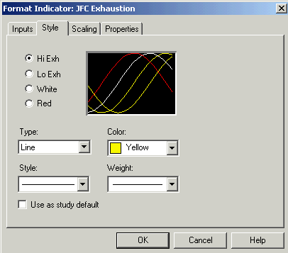
The
style screen for JFC Exhaustion which appears above should have all four plots
set to a line with the style and weight set as shown. The “Hi Exh” and “Lo
Exh” tabs set the color for the two yellow bands on the indicator. The
“White” tab colors the white line and the “Red” plot governs the color
of the red line. These colors may be changed as desired.
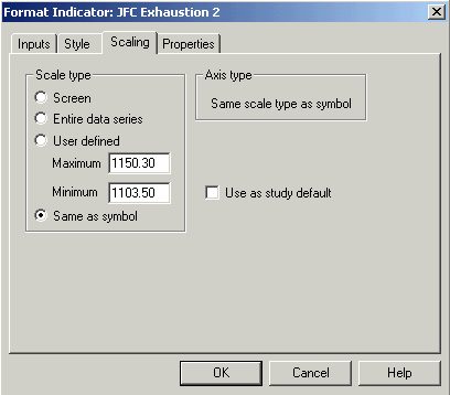
The
Scaling screen should always be set to Same as price data. Other settings on
this screen will make the plots, while still visible, difficult if not
impossible to interpret on a consistent basis.
Properties
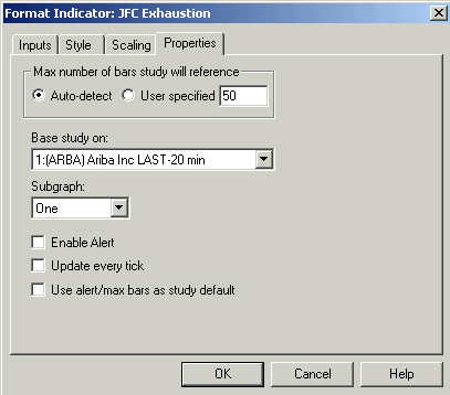
The properties screen for the JFC Exhaustion Indicator should be set as shown in the image on the previous page. These settings will plot the active lines as an overlay on the price bars, which is how I use them in practice.
It
is also acceptable to plot this indicator in a subgraph of your choice. The
interpretation of the indicator will not be altered by using the lines in a
subgraph. The advantage of this usage is to get the four lines away from the
actual price bars, thus making things a bit more clear and less cluttered on the
screen. There is a slight disadvantage in removing the plots from the price bars
in that some find the action of the market itself as it approaches the various
lines of the indicator important to their trading methods.
There
are no alerts active on this indicator.
Objective
This
indicator is used to enhance the exhaustion discovery process which we started
by observing the JFC Reversal Indicator. In the next two sections we’ll
discuss the use of the JFC Real Time Pivot Indicator and the JFC Cluster
Indicator as they pertain to the same process.
Those
who have worked with basic technical analysis will recognize the yellow bands as
being similar to the standard deviation plots which characterize the popular
Bollinger Band indicator used successfully by many traders and analysts.
Although
the exhaustion indicator uses many of the same principles as the Bollinger Band
the programming used to create this plot is a different in that it allows the
indicator to be significantly more self adaptive to the highs and lows of a
price move. Thus this indicator can get you into a move a bar or two sooner due
to its unique self adaptive nature.
The
white plot on the screen is simply an average of the two yellow plots. It
defines the balance point between the two extreme plots shown by the yellow
lines. We will describe other uses for this plot later on in this discussion.
Note
that the market is most comfortable when it is able to stay within the bounds of
the yellow lines you see plotted on the chart. Think of the area between the
yellow bands as a type of “comfort zone” in which the market is content to
reside until some event or price movement takes it outside the bounds of the
described zone. Observe that when the market is forced out of its comfort zone,
it soon finds its way back within the boundaries of the envelope formed by the
yellow plots.
This
is in fact the basis of the operation of this market timing tool. We are taking
advantage of the fact that the market will eventually find its way back within
the “Yellow Zone” so to speak.
When
the price bars leave the envelope the tendency is for them to re-enter and again
leave the envelope multiple times. The price bars themselves act in a rather
random fashion when approaching these envelope boundaries and therefore can make
the definitive interpretation of the indicator signals a bit more difficult if
one concentrates strictly on the activity of individual bars.
This
is due to what we refer to as “market noise”, or random price activity which
is not closely related to the actual forces of the market which we are analyzing
with this trading tool.
To
filter out this random activity we have added a fourth plot to the indicator
which smoothes out the price action to give a more accurate interpretation of
the actual trading signal. This plot is the more rapidly moving red line which
is shown in the accompanying CD ROM Manual Images.
The
purpose of this plot is to more accurately define the general movement of the
market while ignoring much of the noise created by the individual price bars
which can cloud our trading decisions. The red line is a representation of the
general energy level of several bars and gives us a more accurate picture of the
market in general and therefore is a more reliable measure than merely looking
at only one or two bars.
Buy
signals
from this indicator are created when the red line moves below the lower yellow
band and then turns higher on a closing basis.
Conversely,
Sell signals arise when the same red
line moves above the upper yellow line and turns down on a closing basis.
Please
refer also
to Manual Image #1
under manual images on the menu bar.
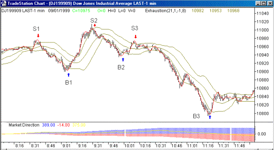
Three
buy signals (B1 through B3) are labeled on the above chart, which is a black
& white version of Manual image #1, You will also see three sell signals
described as S1 through S3.
You
may also notice several instances where the red line left the yellow envelope
and then turned sharply either up or down, signifying a potential buy or sell
area.
We
did not mark these as legitimate sell signals as they would not have received a
valid entry point from the activity of the JFC Entry Point Indicator. Refer to
the Entry Point portion of the manual for an explanation of the use of this tool
to define an exact entry into the market thus, in this particular case, avoiding
a losing trade.
Additional
Use
Occasionally
a market will enter a protracted trending period which will persist for a
significantly longer period of time than one would usually expect.
Our
indicators will work well to get you positioned to take advantage of this
initial trend. We will point out a method by which you can use the JFC
Exhaustion indicator to either re-enter this mega-trend or actually add to your
winning position.
Please
refer to Manual Image #2
under manual images on the menu bar.
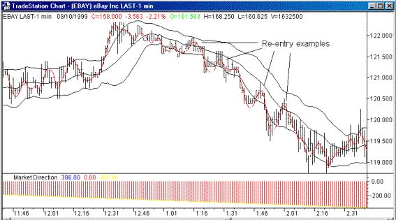
In
the chart of E Bay on the prior page, which is a black & white version of
Manual image #2, the activity of the JFC Indicator Library would have the trader
short for this downtrend at the 121.50 level.
Note
the activity of the red line (the oscillating or smoothing line) with respect to
the white line (the middle line of the 3 line envelope) as this downtrend
progresses.
When
the red oscillating line enters the envelope and begins to approach the white
middle line and then suddenly heads lower it is pointing out the end of a
retracement phase, giving you an excellent point at which to either re-enter the
trade or add to your position. There are four such re-entry points labeled on
our example chart of
Contrast
this activity of the red oscillating line with respect to the white middle line
with its activity near the right side of the chart in the 119.75 area. In this
instance, the red line penetrates through the white line and continues on,
nearly without any hesitation. In this situation, especially if we have
witnessed three successive, valid re-entry positions appear recently, this
activity has a high probability of signaling the end of this protracted
downtrend.
Observation
on Interpretation Early in the Day
When
using the JFC Exhaustion Indicator on intra-day price charts you will notice
that on some days the plots very early on the price charts look considerably
different for a few bars.
This
is a common occurrence on charts where a substantial gap occurs from the close
of the previous day to the open of the day in question.
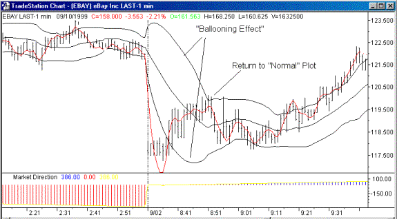
The
plot you see here, which appears as a ballooning effect on the yellow bands, is
a common sequence of events which cannot be avoided as the self adaptive
functions associated with this program adjust themselves for the drastic
difference in price from the last bar of the previous day to the first bar of
today.
You
will notice that after a few bars the plots return to their “normal”
presentations. The amount of “ballooning” will be in direct proportion to
the size of the morning gap. Obviously, one should not attempt to use these
plots for trading purposes until the indicator has completed its adjustments and
returns to a normal appearing plot.
It
is important to keep in mind that we are using historical charts here to
graphically represent the activity of these indicators and how they are
interpreted.
We
must always remember that when using historical data we have the advantage of
interpreting the signals of an indicator while instantly being able to see how
the market reacted to the signal in question.
Obviously,
this is not the case in real time charting / trading as new bars are constantly
appearing on the right side of the chart as new
That's
why it is extremely important to "paper trade" for a time to become
thoroughly familiar with the real time activity of the indicator(s) while the
markets are actively trading.
Many
have gained a false sense of security by relying only upon the observation of
trading tools on historical charts and have paid the
