|
|
|
|
|
|
|
|
JFC Market Direction Indicator Manual
The
JFC Market Direction Indicator is the first of two tools which we will use to
determine the major trend for the day.
Since
it is designed as a day trading tool, this indicator is programmed to work only
on intra-day data. It will not work on daily data.
Inputs
There
are no user selectable inputs for this tool. Therefore your input screen should
appear as below during the insertion process.
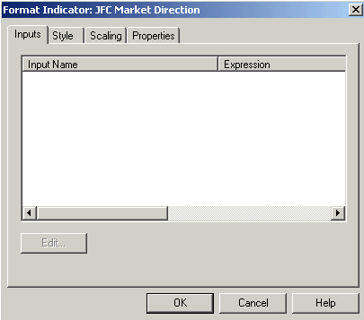
JFC
Market Direction Input Screen for SuperCharts and TradeStation
Style
You may use the style as shown on the next page to change the colors of the three plots for the JFC Market Direction Indicator.
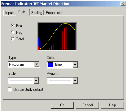
In the upper left portion of the style box you will notice the names for the three plots used by the JFC Market Direction Indicator. The top selection on this menu is labeled “Pos”. Clicking on this item will place a dot in the button to the left of the menu item. This designates that the selections below are the ones which will be effective for the Pos item.
Note that the type is set to “histogram” and the color is set to blue. Also, the style and weight tabs are set to the minimum value for each. These default settings control the blue histogram which measure the positive energy in the market.
Next select the item labeled “Neg”. This tab should be set identically to the Pos tab except the color is set to red. These settings control the type and color of the red histogram which measures the negative energy in the market.
The final item, labeled “Total” should be set to plot a line under the type setting and should be set to the color yellow. This setting controls the color of the cumulative, or balance, line.
Scaling
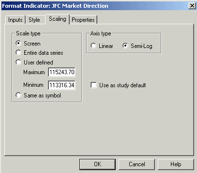
It
is important that the scaling screen for the JFC Market Direction Indicator be
set to screen.
The
numbers which appear under the user defined section of this dialog box will vary
with the chart to which the indicator is being applied. Ignore these values as
they are not used when the scaling tab is set to Screen.
The
Axis Type is always set to Semi-Log.
Properties
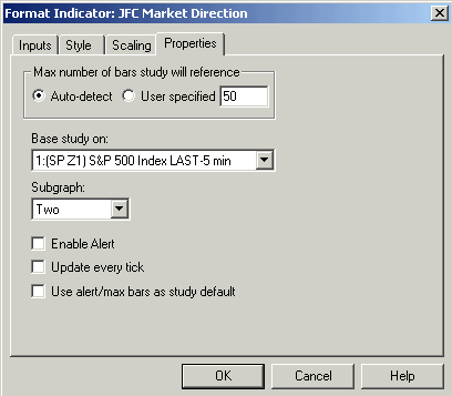
The
“Base study on:” box will detail the chart on which the indicator is being
applied. In this case the indicator is applied to a one minute chart of the Dow
Jones Futures, December contract. This box can be ignored as it is only used
when multi - data charts are used. This does not apply to the JFC Market
Direction Indicator.
The “Subgraph” box
in this case is set to plot in subgraph two. Any setting in this box is
acceptable with the exception of Subgraph one. If the indicator is plotted in
Subgraph one it will cause the plots of both the indicator and price bars to be
distorted to the degree that they are not useable.
If
you have other indicators already plotted on this chart when you insert this
indicator it is possible that the subgraph designation could default to three or
four or even higher, depending on the number of other studies you have on the
chart. This is of no consequence.
There
are no alerts programmed into this indicator, thus the Enable Alert box remains
unchecked.
There is no need to
update this tool on every price change, hence the lack of a check by this item.
Do not check this box unless it is important for you to have this information
updated regularly. Unnecessarily checking this box on some of the more complex
indicators in this package can result in slowing computer performance by
requiring unneeded repetitive calculations on each price change.
Objective
I
can not emphasize enough the importance of identifying the Major Trend of the
day. It is the objective of the JFC Market Direction Indicator to aid you in
making this critical determination.
Accurate,
early trend definition is a very powerful concept which you will need to master
early in your education as a day trader. With this concept fully in mind your
ability to select the trades with the highest probability of a market move in
your direction will increase dramatically.
Many
trades will surface during the duration of a trading day. Our task is to
graphically determine which trades have the best success of increasing the
balance in our trading accounts at the end of the day.
If one could determine,
lets say after the first 90 minutes of the day or less, that the predominant
trend for the day was up, we would then be able to take trades only in the
direction of the predominant trend.
Recall
the old axiom, “the trend is your friend”.
The task here is to determine which way the train is headed early in the
trip. After we know which direction the train is going, the task of riding along
the right way becomes significantly greater.
Later
on in this manual we’ll introduce tools which will tell us when and where to
get on and off the train, and, incidentally, how far to ride each time we climb
on board. But for now, let’s concentrate on figuring out early in the day
which way our train is headed.
In
many ways, trying to trade the wrong side of the market is roughly akin to
standing on the rails attempting to stop the locomotive with your bare hands.
Would you rather ride comfortably on the luxury liner or become “Day Trader
Road Kill” between the tracks?
General
Construction & Interpretation
The
JFC Market Direction Indicator will appear on your chart on subgraph 2 or any other
subgraph of your choice. Do not plot this indicator in subgraph 1 as significant
chart distortion will appear which will
The
plots will appear as two different colored histograms. As with all of these trading tools, a blue color will relate to a buying situation and a red color
will indicate a selling situation is in order. The blue histogram will plot
above the zero line and the red histogram will plot below the line.
This
indicator measures both the positive and negative energies within the market and
then does a comparison between the different energy levels. The positive energy
of the market is charted by the blue histogram while a red plot depicts the
level of negativity in the market.
Therefore, 60 – 90 minutes into the market day,
if you observe more blue than red on the subgraph containing the indicator you
can be confident in expecting an up day for the remainder of the day.
Conversely, an abundance of red visible on the general plot will be telling you
that the most profitable trades will be found on the short side for this day.
There
is a third plot on the indicator which measures the balance between the positive
and negative internal market forces. This calculation is represented by the line
you will see plotted overlaying the histograms. If it is plotted on the red
portion of the indicator it will appear as a yellow line while it will appear as
a white line when it is in the blue portion of the subgraph.
This
line is a very important one to observe occasionally during days which are
identified early on in the trading day as being sideways in nature. Careful observation of this plot can give you an early warning of a
general trend change for the day.
Pay
particular attention to the balance line when it approaches the zero line which
separates the red and blue histogram
plots. If, for instance, the balance line is approaching the zero line from
below and turns back lower then the trend for the day can be assumed to be
sideways to lower. Since this day has earlier been determined to be sideways,
this occurrence can give the daily trend a slight downward bias. Conversely, if
the balance line passes through the zero line of the histogram and continues
higher our sideways day can now be given a slight upward bias.
On
the other hand, if the balance line is approaching the zero line of the
histogram from above the zero line and turns back higher, again it is
appropriate to give a slight upward bias to the trend for the next part of the
day. If, in this instance, the balance line continues on through the zero line
and heads lower, a negative component can be added to the trend of the day.
The
subsequent progression of the balance line for the remainder of the day is also
an important feature of this trading tool with which the trader should become
familiar if one is to gain the maximum advantage from this indicator.
Frequently
the balance line will wander back and forth across the zero line, crossing it
several times early in the day. When this pattern presents itself the trader can
be more confident of the sideways trend which was earlier indicated by the JFC Market Direction Indicator.
These
determinations can be particularly useful, as you can be more and more confident
in taking positions on both sides of the market. In fact, when your confidence
level of a sideways day increases in response to this type of pattern, you may
want to take your positions closer to the indicated exhaustion points as
indicated by any of the four exhaustion point indicators which will be discussed
later in the course.
Often,
these sideways trending days can be quite profitable for the short-term day
trader. Multiple positions can be entered and exited with small profits when the
trader has the knowledge that the market is not going to move very far in one
direction or the other, anticipating several minor trend reversals which can
definitely be traded.
The
key to this entire scenario is the ability to determine the major trend
early in the day. Traders using
this material are encouraged, as one of the primary tasks of this course, to
become intimately familiar with the various patterns displayed by this
indicator. While careful examination of the charts and explanations of this
indicator on the video, there is no substitute for the careful observation of
this tool on both back data and in real time as the market picture unfolds
through the day.
This balance line plot
can also be of use on days when the trend is defined as up or down. After
examining several charts you will notice that on the strongest up days the line
will closely hug the top of the blue histogram without hesitation. Occasionally
on up days you will notice the white line beginning to pull away from the upper
border of the blue histogram. When this slight departure from the blue border
becomes apparent it can be the first hint of a intra-day trend change within the
market.
At
this point the trader will do well to pay close attention to various support and
resistance levels on the chart. It is very likely that the market has
encountered one of our calculated support or resistance levels and may stop to
rest for a while or actually undergo a directional change for the day.
Mastering
the use of the JFC Market Direction Indicator and the several tools we use to
define support and resistance can be a very powerful combination for assessing
general market trends.
The
opposite is also true on strong down days. When the yellow line, in this case,
pulls up and away from the red border one should be on the alert for a possible
trend change. Again, the use of support and resistance information in
conjunction with this phenomenon can be very useful to the trader.
The
chart on the following page depicts the activity of the JFC Market Direction
Indicator on a one minute chart of EBay from August 17, 1999.
Note
that the market rises sharply at the beginning of the day, falters slightly, but
rallies nicely into the close.
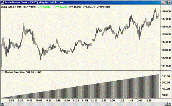
To
the casual observer, this might appear to be a day with mostly sideways action
and one during which a substantial sell off could occur at any time.
However,
the JFC Market Direction Indicator is giving very strong indication that the bull
move will be good for the remainder of the day, as evidenced by the histogram
which rises with each new bar as it measures renewed internal strength in this
stock issue.
Note
the many slight pull backs which were clear invitations to buy the market
throughout the day.
Later
we'll detail additional indicators which will further define these short term
pullbacks as buying opportunities and, additionally, will give exact points of
entry for a move to the upside.
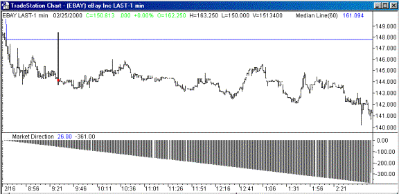
The
next chart above illustrates the activity of the JFC Market Direction Indicator
during a down day in the market. This E Bay chart is quite typical of the
patterns which are presented on a declining day.
Recall
that the trend determination from this indicator is made after only one hour
into the market. That time frame is clearly marked on the chart above by the JFC
Median Line Indicator’s vertical Signal Bar, this is the heavy vertical black
bar which appears near the left side of the chart.
Although
it is not obvious on this small black and white chart, the balance line remains at the base of the lower histogram for the
entire session. This pattern is typical of a day with a strong trend to the
down side.
Note
the multiple selling opportunities which present themselves on this charts the
market attempts to correct the downtrend through the trading day. These selling
points will be clearly defined by our exhaustion indicators, which will be
discussed later in the course.
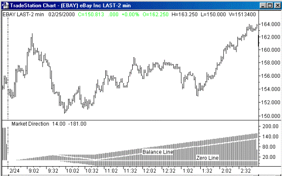
The
chart above is included to illustrate one of the points made earlier in this
section concerning the behavior of the balance line with relationship to the
zero line on the JFC Market Direction Indicator histogram.
After
the initial hour of the trading day (at 9:30 Central Time on the chart), note
that the direction of the market can be determined without question to be
higher. During the next half-hour the market sells off, putting in the lows of
the day. Note on the chart the behavior of the balance line with respect to the
zero line as the lows of the day are being put in place. The balance line
approaches the zero line from above, briefly touches it and then once again
turns higher, confirming the initial assessment of an uptrending day.
In
conclusion, the JFC Market Direction Indicator along with the Directional Day
Filter Indicator, which is discussed in the following chapter, are the two main
trading tools which form the foundation for all other day trading indicators
contained in this course.
There
is no more important component of any day trading strategy than early, effective
definition of the days major trend.
The
proper application and interpretation of these two tools each trading day is
essential to the building of an effective day trading strategy.
Please
refer to JFC Market Direction
Charts
1 through 10 on the menu screen for more individual charts detailing
the use of this indicator on up, down and sideways days.
