Four
Steps Level One Indicators |
| |
|
|
|
|
| |
|
|
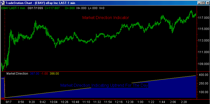
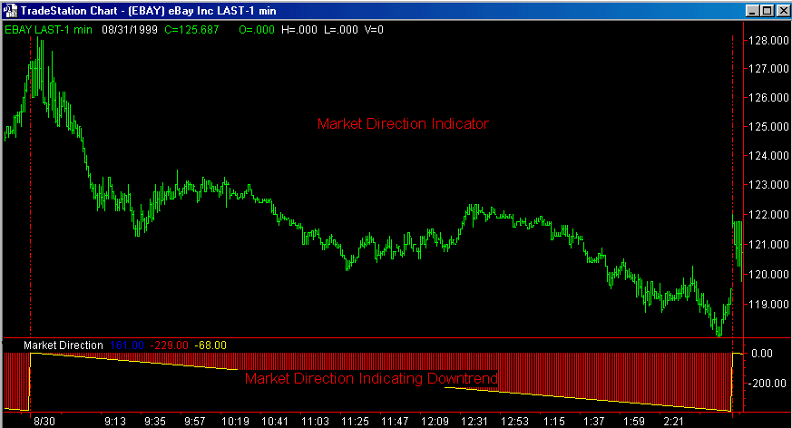
The JFC Market Direction Indicator is used,
in conjunction with the Clayburg Directional
Day Filter, to predict the direction of
the major trend early in the trading day.
The indicator will appear as two different
colored histograms. As with all of these
trading tools, a blue color will relate
to a buying situation and a red color will
indicate a selling situation is in order.
The blue histogram will plot above the zero
line and the red histogram will plot below
the line.
This indicator measures
both the positive and negative energies
within the market and then does a comparison
between the different energy levels.
The positive energy of the market is charted
by the blue histogram while a red plot depicts
the level of negativity in the market.
Therefore,
60 – 90 minutes into the market day, if
you observe more blue than red on
the subgraph containing the indicator you
can be confident in expecting an up day
for the remainder of the day. Conversely,
an abundance of red visible on the general
plot will be telling you that the most profitable
trades will be found on the short side for
this day.
There
is a third plot on the indicator which measures
the balance between the positive and negative
internal market forces. This calculation
is represented by the line you will see
plotted overlaying the histograms. If it
is plotted on the red portion of the indicator
it will appear as a yellow line while it
will appear as a white line when it is in
the blue portion of the subgraph.
This
line is a very important one to observe
occasionally during days which are identified
early on in the trading day as being sideways
in nature. Careful observation of this plot
can give you an early warning of a general
trend change for the day.
Contact Information
Order Form
Download
Entire Indicator Manual FREE
The
appearance of cyan
squares below the price bars is indicative
of a significant downtrend in progress which
is exhibiting signs of exhaustion. In other
words, this indicator signifies that the
current downtrend has reached the point
where other similar downtrends have "run
out of steam" so to speak. When the
cyan squares no longer appear below the
price bars the probability is high that
at the very least the current phase of the
downtrend is decreasing in momentum.
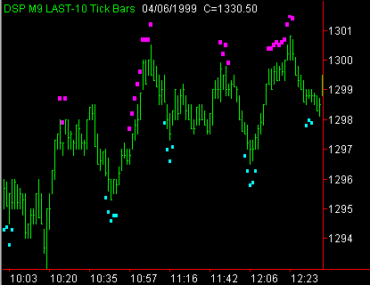
The appearance of magenta
squares above the price bars is indicative
of a significant uptrend in progress which
is exhibiting signs of exhaustion. In other
words, this indicator signifies that the
current uptrend has reached the point where
other similar uptrends have "run out
of steam" so to speak. When the magenta
squares no longer appear above the price
bars the probability is high that at the
very least the current phase of the uptrend
is decreasing in momentum.
1. Buy at the market when the cyan
squares stop
appearing; sell at the market when the
magenta
squares stop
appearing. Higher risk.
2. Maintain a trailing entry stop after
the indicator ceases to appear. For instance,
buy at the highest high of the last three
bars after the cyan squares are no longer
appearing or sell at the lowest low of the
last three bars when the magenta bars fail
to appear. The trader can also use
the JFC Entry Point Indicator as a tool
with which to place a trailing entry stop.
Moderate risk.
3. Use the JFC Real Time Pivot Indicator
to confirm the trend and enter at this point.
Lowest risk.
Inputs: Sens:
Practical range will be 2 - 30. Four to 9
will be optimum depending on data
compression. Again, lower numbers will increase
the sensitivity.
Optimal settings will vary with the market
to which the indicator is to be applied, the
data compression in use and the degree of
sensitivity desired by the individual user.
The trick to making this indicator as individually
useful as possible is the constant observation
of its activity in real time as well as on
historical data. It is also important to periodically
adjust settings and data compressions to obtain
settings which closely match current trend
changes in the market being observed.
Use
this indicator in an automated Trading System
: Four
Steps Level Two Indicators & Systems
Contact Information
Order Form
Download
Entire Indicator Manual FREE
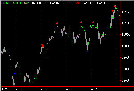
The
JFC Real Time Pivot Indicator has the same
basic uses as the JFC Entry Point Indicator
in that both tools are used in an attempt
to define short term high and low points
in the market.
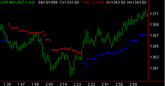
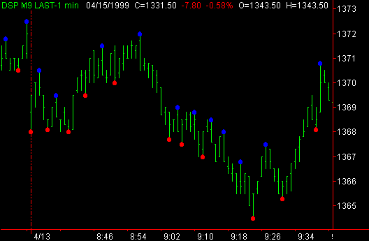
The
Red Dots
above the bars are sell points while the
Blue Dots
below the bars indicate buying opportunities.
There
are, however, important basic differences
in the manner in which these indicators
perform their tasks. First, refer to the
JFC Entry Point section and review the manner
in which they are plotted.
The JFC Real Time Pivot indicator is calculated
by an extensive proprietary algorithm using
overbought and oversold oscillators as well
as multiple momentum functions to define
the interim highs and lows of the market.
It is by these calculations that the indicator
is able to appear in real time and not delayed
by a set number of bars as is the JFC Entry
Point indicator.
The
obvious advantage is the quicker appearance
of the indicator. Unfortunately, a degree
of accuracy, when compared to the Entry
Point, must be sacrificed. In a sharp, protracted
uptrend or downtrend the indicator will
give premature indications of a high or
a low. Using this indicator in combination
with the JFC Rubber Band Indicator and the
JFC Entry Points can greatly increase the
accuracy of this tool.
1. Buy or sell at the market
at the first appearance of a JFC Real Time
Pivot Higher risk.
2. Buy or Sell at the market when the JFC
Real Time Pivot appears in conjunction with
a signal from the JFC
Exhaustion Indicator. High - Moderate
risk.
3. Buy or Sell at the market when the JFC
Real Time Pivot appears in conjunction with
a signal from the JFC
Exhaustion Indicator and the JFC
Reversal Indicator is indicating a reversal
within a few bars of the high. Moderate risk.
4. Use the JFC Entry Points as trend confirmation
and points for buy or sell stops for entry
after the appearance of the above combinations
of the JFC Real Time Pivot, JFC
Exhaustion Indicator and the JFC
Reversal Indicator. Lowest risk.
1. FDB:
On a scale of 1 - 100, the FDB input sets
the indicator sensitivity for the buy signals
from the indicator. A lower number equals
a higher sensitivity and thus fewer, but
possibly more accurate signals. Suggested
range = 5 to 15; optimal setting is 9.
2. FDS:
On a scale of 1 - 100, the FDB input sets
the indicator sensitivity for the sell signals
from the indicator. A higher number equals
a higher sensitivity and thus fewer, but
possibly more accurate signals. Suggested
range = 85 to 95; optimal setting is 91
Use
this indicator in an automated Trading System
: Four
Steps Level Two Indicators & Systems
Contact
Information
Order Form
Download
Entire Indicator Manual FREE
The JFC Exhaustion Indicator
is one of the more complex tools to understand.
On the other hand, when properly mastered,
it can be one of the most rewarding when attempting
to ascertain turning points in the market.
The first components of the indicator are
the two yellow bands that are generally plotted
above and below the price bars. These are
standard deviation plots that are a derivative
of the Bollinger Band indicators available
in the standard TradeStation indicator library.
The difference is that the JFC Exhaustion
Indicator takes into account the high, low
and close of the individual price bars rather
than just the close. This tends to give the
trader a truer picture of price action as
exhaustion approaches.
The white plot which runs between the two
yellow bands represents the mid point between
the high and low exhaustion points. It is
a simple average of the upper and lower plot.
The red line is an average plotted on the
price bars themselves and is an independent
calculation from the ones which produce the
exhaustion bands.
It is very important to realize that markets,
trends, or most anything else for that matter,
will not continue in one direction or another
forever. There comes a time when the trend
will reverse and go in the opposite direction
for a while. Nature has a way of constantly
trying to achieve equlibrium.
Think of a market trend
as a basketball which you have thrown up
into the air. It will certainly rise for
a period of time. Eventually its rate of
climb will slow (exhaustion), its ascent
will cease and it will begin a decline (trend
reversal).
It is fairly widely accepted that markets
will trend for only 25% of the time. During
the remaining 75% they are in a sideways
phase. It is during this sideways phase
that exhaustion indicators are valuable
in detecting turning points in the markets.
There are multiple interpretations that
may be derived from the plots of this indicator.
First notice that the
price bars will trail along quite closely
with the upper or lower exhaustion (yellow)
plots. Note the abrupt change in price direction
when the price bars suddenly leave the vicinity
of the yellow lines.
Now observe the red line
plot which is an average applied to the
price bars. This line smoothes out the price
activity relative to the exhaustion bands.
Observe what happens when the average (red)
line passes through the exhaustion bands,
makes a peak or valley, and then turns in
the opposite direction. This type of action
regularly appears at short term turning
points in the market.
The white line plot can
have multiple uses depending on the market
being traded and the data compression being
used. One use of this line is as an entry
point after a trade is signaled by the red
line passing through the exhaustion bands
and then making a turn. The more aggressive
trader may wish to take a position when
the turn of the red line occurs outside
the exhaustion band. In this instance the
white line can be used as an objective for
the trade or as a point at which the trend
is confirmed.
You will also find the
Exhaustion
2 Indicator helpful in the interpretation
of this concept.
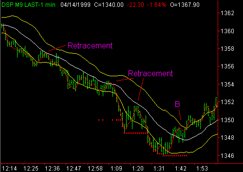
Although
the primary use of the exhaustion indicator
is the identification of turning points,
there is alternative interpretation which
can be used in a trending market. When a
trend is identified with the use of the
Market Direction Indicator, the Volume Direction
Indicator and the Intraday Hi - Lo Indicator,
the Exhaustion Indicator can be used to
identify retracement points at which entries
can be taken inthe direction of the persistent
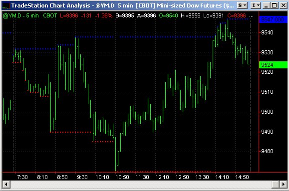
trend. In the chart to the left note the
activity of the market when the red line
pulls back between the yellow bands and
briefly encounters the white line. These
retracement areas frequently provide excellent
entry opportunities.
Also,
note the difference in the pattern at point
B when
the red line proceeds abruptly through the
white line and proceeds through the upper
yellow band before it goes back below the
white line. This pattern, following multiple
retracement signals, often signals the end
of the short term trend.
Note
the presence of the Intraday Hi - Lo indicator
(small red dots) as it identifies the new
lows being made by the market as the floor
traders run the stops below the low of the
day.
Use
this indicator in an automated Trading System
: Four
Steps Level Two Indicators & Systems
Contact
Information
Order Form
Download
Entire Indicator Manual FREE
The
JFC Exhaustion 2 Indicator will plot
a dot (white) on the red line after it has
crosses above the upper band and turned
lower or has crossed below the lower band
and turned higher.
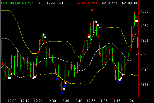
This tool is designed as an aid for the
interpretation of the JFC Exhaustion indicator.
It can
be used in conjunction with the companion
indicator. When used in in this manner,
it makes the turning points of the red line
easier to observe and therefore determine
when the trend has changed according to
the JFC Exhaustion
indicator.
This
tool can also be used as a stand alone tool.
It is quite interesting to observe the pattern
created when this indicator is used along
with the JFC
Real Time Pivot indicator (Red and Blue
Dots). You will readily note that the real
time pivot will often slightly precede the
actual turning point in the market while
the JFC Exhaustion 2 indicator will slightly
lag the turn. The two, when used together,
can be a very powerful trading tool.
CAUTION:
When using this indicator with the JFC
Exhaustion Indicator be sure the inputs
for the two indicators are identical to
each other. The plots will not match up
if different inputs are being used.
Use this indicator in an automated Trading
System : Four
Steps Level Two Indicators & Systems
Contact
Information
Order Form
Download
Entire Indicator Manual FREE
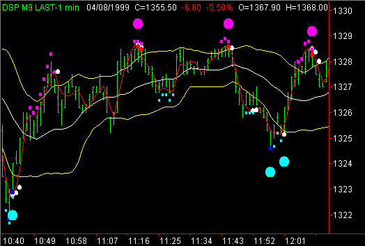
The appearance of a larger
magenta dot above a price bar indicates
that the market may have reached a significant
exhaustion point indicating a possible selling
opportunity.
The appearance of a larger
cyan or light blue dot above a price
bar indicates that the market may have reached
a significant exhaustion point indicating
a possible buying opportunity.
1. Buy
or sell at the market at the first appearance
of a JFC Cluster Indicator Dot. Higher risk.
2. Place a buy or sell stop at the last
pivot identified by the JFC Entry Point
indicator. When the market then trades through
the support or resistance defined by the
pivot indicator you will enter the market
at the point at which support is violated
following exhaustion. Lowest risk.
Inputs:
Plt. This input will define where
the indicator dot will be plotted (plt)
in reference to the high or low of the bar
in question. For instance, on an S&P
chart, a 5 entered here will plot the dot
5 points above the high of a high exhaustion
point and 5 points below the low of a low
exhaustion point. Experiment with this plot
until you are visually comfortable with
the presentation.
I've
found this indicator to be particularly useful
in combination with the Real
Time Pivot, Reversal,
and Exhaustion
2 indicator.
Since all of these programs utilize different
pattern recognition scenarios, an area in
which all 4 are signaling an upcoming price
move has a higher percentage of accuracy that
using any of the tools separately.
Use this indicator
in an automated Trading System : Four
Steps Level Two Indicators & Systems
Contact Information
Order Form
Order
Form
for Cluster Only
Download
Entire Indicator Manual FREE
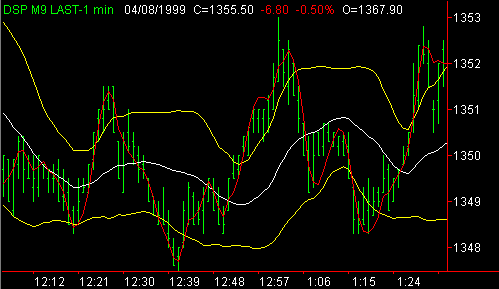
The Volatility Stop Indictor,
as with many indicators, has as its principle
function the definition of the current trend.
Note that when prices are above the Uptrend
Volatility Line (UVL)
the trend as defined by this indicator
is considered to be up. When the prices are
below the Down Volatility
Line (DVL) this indicator is
considered to be down. The UVL should be plotted
as blue as it defines an uptrend. The DVL
should be plotted as red as it defines a downtrend.
The market changes from an uptrend to a
downtrend when a bar CLOSES below
the plotted UVL. Note that the low of the
bar can be plotted below the UVL without
initiating a trend reversal to down.
The market changes from
an downtrend to a uptrend when a bar CLOSES
above the plotted DVL. Note that the high
of the bar can be plotted above the DVL
without initiating a trend reversal to up.
The unique trend defining
function of this indicator is its ability
to give the market additional flexibility
when an increase in volatility occurs. While
one may obtain several definitions of volatility,
for the purposes of this indicator we will
consider volatility to be higher when the
range, or distance between the high and
low of a bar, increases for each bar.
IMPORTANT:
Note that as the average volatility of the
price bars increases the DVL or UVL reversal
lines can actually move farther away from
the price bars thus giving the market time
and space to work itself through a volatile
time period without subjecting the defined
trend to successive, frequent changes which
can occur during periods of increased activity.
If the increased activity is indeed indicative
os a trend change the change will be confirmed
when the activity is of sufficient strength
to actually break the trend line.
None.
This indicator is not intended to be used
as an entry tool. Its best use is for trend
definition and stop placement.
Since the trend is defined to
have changed when the market closes above
or below the indicator lines, this indicator
provides an excellent tool for the placement
of trailing stops, particularly after a sustained
move in the market and the line has drawn
close to the price bars.
Length: Range = 7 to 35;
21 to 28 is optimal. Higher numbers = decreased
sensitivity.
Factor: Range =
2 to 8; 4 to 6 is optimal. Higher numbers
= decreased sensitivity.
Use this indicator in an automated Trading
System : Four
Steps Level Two Indicators & Systems
Contact
Information
Order Form
Download
Entire Indicator Manual FREE
The appearance of a blue dot
above a price bar indicates that this bar
is a significant high defined by the sensitivity
settings of the indicator.
The appearance of a red dot
below a price bar indicates that this bar
is a significant low defined by the sensitivity
settings of the indicator.
1. Buy or sell at the market at the first
appearance of a JFC Entry Point Indicator
Dot. Higher risk.
2. Use this indicator as a confirmation
of the trend as established by the JFC
Exhaustion Indicator,
the JFC Real
Time Pivot Indicator and/or the JFC
Reversal Indicator. Enter when the market
trades through the blue or red dot thereby
confirming the trend. Lowest risk.
Inputs:
Strength: Practical range will be 2 - 5.
Two will probably be optimum. Lower numbers
will give a higher sensitivity.
The most important aspect of this indicator
is to realize that for a bar to be marked
as a high or low there must be an equal
number of bars both prior to and following
the bar which, in the case of a high, have
lower highs than the market bar, or in the
case of a low must have an equal number
of bars both prior to and following the
bar which have higher lows. The strength
input defines the requisite number of bars
necessary to form the high or low.
Since there must be the
requisite number of bars following the bar
in question, the high or low will not appear
on your screen until the correct number
of bars have been plotted. Therefore, in
the case of a high, the high bar will not
be marked when it appears - it must wait
the strength number of bars to be marked.
This feature of the indicator reduces the
effectiveness of the highs or lows since
their appearance is delayed in real
time.
The prime use of this
indicator is its ability to identify short
term support and resistance. If the market
trades through a blue dot which marks a
high (resistance) the trend is confirmed
as an uptrend. If the market trades down
through a red dot (support) the trend is
confirmed as a downtrend.
This indicator is most
useful when used in combination with a second
trend defining indicator. There are many
indicators which can be referred to as trend
definition indicators. We use the JFC
Reversal Indicator as our prime trend
definition tool. Others are the JFC
Real Time Pivot Indicator, the Clayburg
Directional Day Filter Indicator, and
the
JFC Volatility Stop Indicator. Other
indicators can also be used for trend definition
i.e., stochastic, RSI, Percent R, MACD,
etc.
A practical demonstration
of the use on this indicator would be the
case in which the JFC
Reversal Indicator was displaying cyan
dots below the price bars. When the cyan
dots cease to appear the downtrend becomes
suspect. When the market trades up through
the last blue dot formed by the pivot indicator
the trend is confirmed as being higher for
the short term. Conversely, when the magenta
dots cease to appear the uptrend becomes
suspect. When the market trades down through
the last red dot formed by the pivot indicator
the trend is confirmed as being lower for
the short term.
Optimal settings will
vary with the market to which the indicator
is to be applied, the data compression in
use and the degree of sensitivity desired
by the individual user.
The trick to making this indicator as individually
useful as possible is the constant observation
of its activity in real time as well as
on historical data. It is also important
to periodically adjust settings and data
compressions to obtain settings which closely
match current trend changes in the market
being observed.
Use this indicator
in an automated Trading System :
Four
Steps Level Two Indicators & Systems
Contact
Information
Order Form
Download
Entire Indicator Manual FREE
The
JFC Intraday Hi Lo Indicator is a useful
tool which is used to automatically notify
the user when the high or low of the current
day is being approached.
This indicator is used only on intra-day
charts.
The JFC Intraday Hi Lo Indicator plots a
series of blue dots at the high of the day
and a series of red dots at the low of the
day.
Contact
Information
Order Form
Download
Entire Indicator Manual FREE

|